


Here's something cool that you can do from within your administrative control panel: hide and show text blocks on user click.
If you click the link again, it'll slide out and disappear.
This is something you can do on your site as well. This feature is available both in primary page content and in blogs. Read more below to find out how to do this.
Click to reveal!
There are two magical styles that you'll need to create. The first one is called "clickToRevealLink", and the second is called "clickToRevealContent". When you create these styles in your style module, be sure to name them exactly, including the upper and lower case. You can define those styles however you like. A very basic styling might look like this:
color:blue;
font-weight:bold;
cursor:pointer
border:1px solid black;
padding:10px;
margin:5px;
Once these magical styles are created, you can use them anywhere you like. Here's what happens: if you use the clickToRevealLink style in a page, and a user clicks on that text, the user's browser will search through the following text until it finds the very next paragraph that uses the clickToRevealContent style. If the style is found, that paragraph will slide open.
Note that you don't need to have the link and content styles adjacent to each other, though in most cases that's what you'll want to do!
You can, of course, get more "fancy" with your styling of the clickToReveal styles. I uploaded a bullet image (the star) into one of my image galleries, and then used the background-image style to insert the image to the left of the text. You can also use fancy properties like border-radius and box-shadow to make your content prettier.
Bear in mind, however, that some styles like border-radius and box-shadow have (as of the writing of this blog post) non-standard implementation between browsers. In other words, you may need multiple style definitions in order to guarantee that your style works well in all browsers.
Welcome to the wonderful world of styling on the internet. :P
One of the biggest struggles people face in managing the content on their websites is assuming that CKEditor (the editor we use for managing HTML input) is as powerful as a desktop word processor, and that they can make things as fancy on the internet as they can in a document on their desktop computer.
Maybe someday...
Here's the thing: if you build a document in Microsoft Word, and email it to 1,000 friends, when they open it, it'll look just the same to them as it does to you. But if you create a web page and email it 1,000 friends, when they open it, it'll look very different depending on
- their browser (Firefox, Chrome, etc. - or the dreaded Internet Explorer!)
- the size of their display
Here's some advice for designing content for your pages:
- Don't right-align (or left-align) two objects in close proximity to each other. If you have two images you want to block in with text, and they are relatively close to one another on the page, left-align one, and then right-align the next. That will help avoid collisions.
- If you need to give two objects the same alignment, and they are in close proximity to each other, create a style with the style command clear:both; which forces the following content to be shifted below whatever objects are floated left or right.
- Keep it simple. Your content ought to be mostly text, with perhaps some images or other content to highlight things here and there.
- Remember that you can't do *everything* that you could in a desktop word processor. Your goal is to make your site as pretty as possible within the limitations of what you CAN do.
- Check your site in several different browsers.
- Use Firefox's developer tools to see how your content looks in different sized devices.
- Also make use of our responsive design preview mode when you are editing your content.
- If you can't get it to do what you want, take a deep breath, walk away for awhile, and tell yourself that it's probably not YOUR fault - it's probably simply a limitation of HTML design. Then come back and say, "What's a less complicated way of doing what I want?"
What is a media query? A media query is basically the website querying the browser to say, "What kind of display is this?" The answer to that question may include information like "The browser is 800 pixels wide." This is very important information, because your web developer uses these responses to format your website. For example, in this website, if the width of the browser is less than 800 pixels, the format changes from two columns to one, and the menu bar gets narrower. If it is narrower than 600 pixels, the menu bar moves to the bottom of the page.
For the most part, your developer has handled the ugliness of media queries, so your site will function nicely in all size browsers (including small mobile devices). But there may be occasions when you want to change the appearance of your style based on a media query. We make that possible.
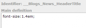
Consider this blog as an example. This blog has a header font which is 1.4em in size. The style command shown above is the command that creates this font.
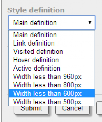
Notice that above the definition is the identifier, and under that you will see the words "Main definition." The main definition is not the only definition; you can override the definition by chosing another definition from the drop-down list:
By choosing one of these alternate definitions, you can override the behavior of the style under different circumstances. In particular, I added the style command font-size:1.1em to the 800px definition, as shown here.
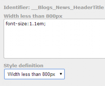
Now, if the site is being viewed in a smaller device, that title font appears smaller, in order to help avoid having wrap-around titles.
One important rule to keep in mind is that as you go down the list of definitions, any definition overrides previous definitions. It can be tricky to get used to, and you should practice on pages that are not live on the site, in order to get the hang of it without the public seeing your experiments!
404 Pages can be annoying. They can be annoying for visitors, but they can also be annoying for website owners. A 404 error means that someone tried to access a page on your site which does not exist.
Why doesn't it exist? Well, it might be that the page used to exist, but you decided you no longer needed that page. Removing pages can be a bad idea; if someone has linked or shared that page, then you'll get a bunch of visitors who find a 404 error instead of your site. That's why we don't allow you to directly delete pages you've created. Instead, you can set them as redirects, which points them to a different page on your site. That way visitors coming there won't see the dreaded 404 message.
It's also possible that someone linked to a page on your site, but they accidentally typed the URL wrong. So now they're sending a bunch of people to your site, but to a non-existent page! They meant well, but didn't really help you all that much.
Building a 404 page can be tricky, but we've taken most of the complexity our of the process. Why can it be tricky? Because you can't use any relative URLs. Relative URLs are URLs that don't have a complete path. Suppose a visitor is looking at my home page: virtuweb.net/index.php. And in that page I want to display the site icon. I can set the image URL in one of two ways: I can spell it out completely: http://virtuweb.net/images/logo.png?x=5, OR I can use a relative path: images/logo.png?x=5. The second choice is a nice one, because it's shorter, and therefore decreases the file size by a few characters. The relative path simply means "whatever directory you are in, find the images folder in there, and then find the logo.png?x=5 file in there."
But you can't do that with a 404 page. Why not? Because someone might access the 404 page by going to virtuweb.net/notvalid/. If I'm using a relative path here, the site is going to try to find the image in the nonexistent folder notvalid/images!
So what to do? Simple! Don't use relative paths in your 404 page. We take care of this for you if you are including images in your Page404, but if you are adding links, you must remember to use a full path instead of a relative path. And that's it! We take care of everything else!
In the world of the arts, composers, painters, sculptors and other artists are often hailed as innovative and creative if they throw out all the rules and do something completely avant-garde - completely unexpected and never-before-seen.
The world of the internet, though, is a little different. You can't just throw out the baby with the bath water, so to speak. There are conventions that should be followed. And they should be followed because they work. Remember that your website is not just a work of art - it also has to be functional and useable. Your visitors have to be able to find information, and your site needs to be easy to read. With that in mind, here is a short list of Keeping it Clean rules. Like the Pirate's Code, they are more like guidelines. But they should be carefully considered.
#1: Please don't write all in caps. IT'S LIKE SHOUTING AT YOUR VISITORS!
#2: Don't use bizarre fonts. Verdana and Arial are good sans-serif fonts. Times New Roman and Georgia are decent serif fonts. Avoid script fonts and fantasy fonts. Generally speaking, sans-serif fonts are a little easier on the eyes.

(And by the way, if you have to break either of these rules, for heaven's sake, please don't break both of them simultaneously - there is nothing attractive about the line of text above!)
#3: Even if you think it looks cute and/or attractive to center your text, it's harder for your guests to read, so be a good host, and unless there's a really good reason to center, keep things left-aligned.
#4: Don't require your visitors to download massive images to view your page. This rule we actually take care of for you. When you upload an image to your photo galleries, we create a thumbnail, and that thumbnail is what gets displayed on the page. When your visitors choose to click the image, that's when they get to see your full sized image.
#5: Avoid low-contrast fonts/backgrounds. You should probably use a very pale (perhaps even white!) background for your text, and use a very dark font on it. In some cases you can do light colored text on a dark background, but that is harder on the eyes, so use that sparingly.

#6: Along with the previous advice, don't use a lot of different colored fonts. There's a reason why our text editor doesn't have a color chooser. You can still used colored fonts, but you have to create them as styles. And the time it takes you to create that green or blue or red or purple font - that time will give you a chance to think very carefully about whether you need that colored style cluttering up your site!
#7: White space is your friend. Don't cram your text or images together. Give yourself plenty of padding all around your text. The flip-side of that is - you don't want to have so much white space that your most important content is below the fold.

#8: Please use proper grammar, punctuation and spelling. If you need a proofreader for your work, please consider contacting our partner service: Portland Proof.
#9: Bright, garish colors should be used as accents, if they are used at all. You can get away with a little more if you are building a site designed for children, but as a general rule, colors that immediately catch the visitor's eye should be a small percentage of your site's color. If there's too much eye-catching color, your visitor won't know where to look, and will eventually leave your site with a feeling of visual fatigue.
#10: Keep your site consistent. Perhaps the content of your site will startle your visitors, but the layout of it should never do that. If your navigation menus are at the top of the page on some pages, that's where they should be on all pages.