


What is a media query? A media query is basically the website querying the browser to say, "What kind of display is this?" The answer to that question may include information like "The browser is 800 pixels wide." This is very important information, because your web developer uses these responses to format your website. For example, in this website, if the width of the browser is less than 800 pixels, the format changes from two columns to one, and the menu bar gets narrower. If it is narrower than 600 pixels, the menu bar moves to the bottom of the page.
For the most part, your developer has handled the ugliness of media queries, so your site will function nicely in all size browsers (including small mobile devices). But there may be occasions when you want to change the appearance of your style based on a media query. We make that possible.
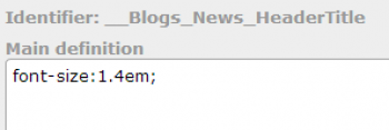
Consider this blog as an example. This blog has a header font which is 1.4em in size. The style command shown above is the command that creates this font.
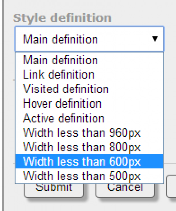
Notice that above the definition is the identifier, and under that you will see the words "Main definition." The main definition is not the only definition; you can override the definition by chosing another definition from the drop-down list:
By choosing one of these alternate definitions, you can override the behavior of the style under different circumstances. In particular, I added the style command font-size:1.1em to the 800px definition, as shown here.
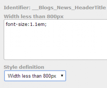
Now, if the site is being viewed in a smaller device, that title font appears smaller, in order to help avoid having wrap-around titles.
One important rule to keep in mind is that as you go down the list of definitions, any definition overrides previous definitions. It can be tricky to get used to, and you should practice on pages that are not live on the site, in order to get the hang of it without the public seeing your experiments!