


Mobile Friendly Websites
With VirtuWeb, a mobile friendly website is not an "extra" - it's the way we do things, and it's the only way we do things. Occasionally we see small businesses and educational institutions trying to cut corners by hiring web developers who are still doing things the "old" way - a fixed width website that doesn't scale well into mobile devices.
This worked in the 90s and early 2000s, but not any more. When you contact us, you don't need to ask us whether the site we develop for you will be mobile friendly; the answer is yes! And please do not ask us to cut corners by skipping that part of the development process; a website that doesn't scale well to mobile devices reflects poorly on us, so the answer will be no!
Responsive design is a technique rather than a technology. Responsive design is a way of describing the fact that your website layout will respond to the size of the device it is being displayed in. All of our sites are designed responsively.
Responsive Design
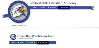
Here are just a few examples of how we use responsive design techniques to make sites smoothly fit into smaller devices such as tablets and smart phones. Click the thumbnail image next to each description to see an example image. In each example, the top half of the image is how the site appears on a full-sized device, and the lower half is how the site appears on a smaller device.
Headers restructure to comfortably fit in smaller spaces.
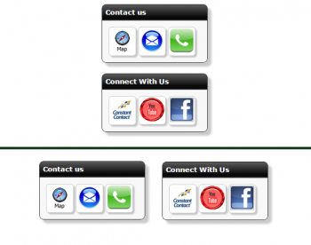
Sidebar objects shift from vertical placement on the side to horizontal placement at the bottom.
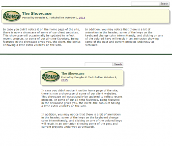
Two column formats become one column formats in mobile devices.