


Responsive Design is a way of structuring your website so that it functions well in both mobile and desktop devices. In simple terms, a site built with responsive design will respond to different size devices by shifting content around or - in some cases, even causing some content to disappear.
Here's an example you might be familiar with: For visitors with a wide screen, Facebook displays a sidebar on the right with a list of friends who are currently online, as well as a ticker of recent news stories in your news feed. Haven't seen that? Well, if you haven't that's because your screen isn't wide enough. What does facebook do in that case? They simply hide that sidebar. It just isn't there. That's responsive design.
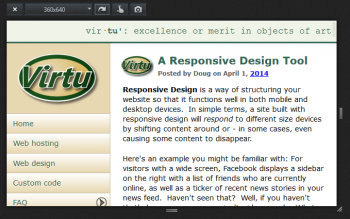
Do you want to see how your site looks in different size windows? Firefox has a great tool to help you out with that. It's called Responsive Design View. You can access the Responsive Design View in a couple ways:
- From the main menu, slide down to 'Web Developer' and then select 'Responsive Design View'.
- Just press CTRL-SHIFT-M to toggle this view on and off.
When you choose this tool, your browser squeezes your content into a small rectangular block in the upper left corner of the browser window. Notice that above the block there is a dropdown list that shows you the current size. The size listed will be a standard device size.
Also notice that next to the size dropdown, there is a 'rotate' button (it has an arrow icon). This will toggle the dimensions from portrait to landscape, so you can see what your site would look like if someone was holding their device in a different orientation.
Choose different sizes and orientations, and see how your site looks. This is especially a good idea after you've added new content which contains images or other special content; you'll want to make sure these things display properly in all devices!