


In my previous post I talked about how you can use Style Groups to set up styling of Menu items. The same feature is also available in other modules, such as the Blog module. This blog, for example, uses a style group I created called News. Styles in this group have names like _blog_News_HeaderBlock and _blog_News _HeaderByline, which control the appearance of the various components of a blog post.
One of the nice things about style groups is that you can use them to quickly change the appearance of an entire section of your website. For example, I could set up a second style group (maybe call it something like News2). Then I would have a whole new set of styles with names like _blog_News2_HeaderBlock, and so forth. And then I can - at a whim, change the entire appearance of the blog, simply by specifying a different style group.
But Why?
Why does it matter? Why would you want to be able to swap out the styles quickly and easily? Well, there are a couple reasons. One is that it keeps your visitors from getting visual fatigue if they occasionally see something a little different on the site (I'm not talking about massive, headache-launching changes - I'm talking about subtle differences).
The other reason is that by experimenting with different styles, you may discover that certain layouts increase or decrease the amount of time people spend on your site, or how much they interact with the site.
So play! Create style groups, and see how they look!
In the old days of web design, a client approached a web designer and said, "I want a site, and I want it to look like this." The web designer would build the site, and then, if the client decided they wanted to change the appearance of the site, they'd have to go back to the developer and say, "I'd like to hire you to make these changes."
These days, site owners want a little more control over the way the site appears, without having to go back to the designer for every little change. This is great, but it's also dangerous, because not very many site owners really understand the complexities of styling a website. What's more, now that we've entered the world of mobile, styling a site is even more complicated (see our blog post on Responsive Design), because your web designer specified that your site should be styled differently depending on the size of the browser window that's viewing it.
Complicated? Oh yes.
So how do we strike a balance? Well, we store all the site styles in two places. The first is in a stylesheet called styles.css. This stylesheet contains all the really important structural details of your site, as well as the mobile optimization styles. Your administrative software doesn't give you access to this stylesheet - it is immutable.
The second stylesheet is called custom.css. You might have guessed from the name - this is the one you can change. Any time you visit the Styles module of your admin software, you are modifying that style sheet.
This lets you have some control of the visual look-and-feel of the site, without quite as much risk to the overall layout of the page. (It's still possible to cause issues for your site, so play with the styles cautiously, and view the site each time you make a change!)
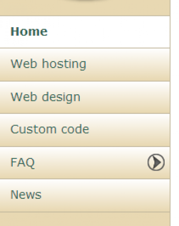
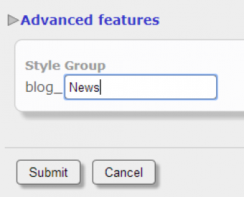
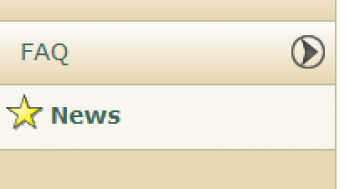
So let's talk about a specific example. Let's talk about the menu bar on this site. Here it is. You can click on the image to see it full size. I was thinking to myself that it would be nice if the menu option for the news blog had something that set it apart from all the others - something that made it stand out, so visitors would have their attention drawn to it.
I know - I'll make it bold, and a larger font! So here I go; I'm going to edit my News menu item, and under "Advanced Features" I enter "News" as the name of a new Style Group. What happens next? When I save the menu item, two new styles are created. They are called _menu_News_Selected and _menu_News_Unselected. Modifying those styles will change the appearance of the menu. So let's try changing the _menu_News_Unselected style to: font-weight:bold:font-size1.2em;.
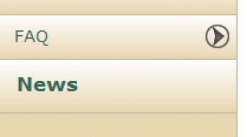
Now my menu looks like this.
But I don't have to stop here; I can try other things. For example, what if I want to have a star next to the menu? I create and upload a star image to one of my media galleries, then set the css background properties to include that star - and don't forget to pad the text on the left to make room for the star! And now I have this.
Obviously, website owners need to have some understanding of CSS to play around with these features, but it does give you some control over the appearance of your site.
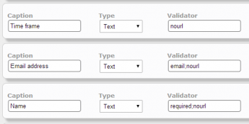
As you are developing forms for your site, you'll see a text entry field for a Validator. Validators are simple to use, and not difficult to understand. The premise is simply this: by choosing a validator, you instruct the server to compare the user's data entry value to a particular rule. If the data does not pass the rule, the form will not be submitted, and the user will be instructed to fix any invalid entries.
required: If the user leaves the field blank, the form will not be submitted.
number: the user must enter a number.
alphanum: the user must enter an alphanumeric (combination of numbers and letters).
alpha: the user must enter a string that only contains letters.
email: loose validation of an email address: requires an @ and a period.
nourl: this validator is designed to decrease spam - if the form entry contains a url, the form will not be submitted.
length, minlength, maxlength: specify a length, minimum length, or maximum length. Example: minlength:6.
Special cases
If your data entry element is a drop-down list, you will not have the option to add validators. The form will automatically be validated against the options in the drop-down list.
If your data entry element is a checkbox, you will have the option to add validators, but the only validator that can be used is required. Setting the validator to required means that the user cannot submit the form without checking the checkbox. This is useful for forcing users to accept a terms of service agreement before submitting.
Combining Rules
You can specify multiple rules by putting a semicolon between then. For example, the validator string required;nourl requires an entry, and verifies that the data entry is not a URL. Note that using a semicolon requires that ALL rules specified are passed.
Combining rules will also allow you to set a range of lengths. For example, the validator string minlength:8;maxlength:12 forces the user to enter a string that is between 8 and 12 characters long.
If you want to use OR validation, put a comma between the validators. For example, the validator string email,alpha requires that the data entry either be an email address or a string of letters.
You can also get more complicated by stringing together groups of validation rules. The important thing to remember is that 'OR' validation happens before 'AND' validation. For example, if you use the validator string alpha,numeric;nourl, the data entry will pass if it is either an alpha or a number, but in either case, it cannot contain a URL.
Responsive Design is a way of structuring your website so that it functions well in both mobile and desktop devices. In simple terms, a site built with responsive design will respond to different size devices by shifting content around or - in some cases, even causing some content to disappear.
Here's an example you might be familiar with: For visitors with a wide screen, Facebook displays a sidebar on the right with a list of friends who are currently online, as well as a ticker of recent news stories in your news feed. Haven't seen that? Well, if you haven't that's because your screen isn't wide enough. What does facebook do in that case? They simply hide that sidebar. It just isn't there. That's responsive design.
Do you want to see how your site looks in different size windows? Firefox has a great tool to help you out with that. It's called Responsive Design View. You can access the Responsive Design View in a couple ways:
- From the main menu, slide down to 'Web Developer' and then select 'Responsive Design View'.
- Just press CTRL-SHIFT-M to toggle this view on and off.
When you choose this tool, your browser squeezes your content into a small rectangular block in the upper left corner of the browser window. Notice that above the block there is a dropdown list that shows you the current size. The size listed will be a standard device size.
Also notice that next to the size dropdown, there is a 'rotate' button (it has an arrow icon). This will toggle the dimensions from portrait to landscape, so you can see what your site would look like if someone was holding their device in a different orientation.
Choose different sizes and orientations, and see how your site looks. This is especially a good idea after you've added new content which contains images or other special content; you'll want to make sure these things display properly in all devices!
One of the challenges of building content for a website is deciding how to lay out pages in a way that looks great on a desktop monitor, but also looks great on a mobile device that is as narrow as 640 pixels, or even 320 pixels.

Columns
When you are generating content for your site, you may notice an icon that appears like an arrow curved down and then upward. That icon is your column break icon. Using this will insert a column break marker in your content. But how does the two-column format play out in the world of mobile?
Very simply. Your website will display the content in a two column format in a wide device, but in a narrower device, that second column will shift downward, and will appear below the first column instead of next to it.
For this reason it's important to remember that when writing content, you should not refer to anything in the second column as being "next to" or "to the right," because depending on the device, it may not be next to the first column at all!
Also, remember that if all your images are in the second column, they are "below the fold" (not visible without scrolling) for mobile users. For this reason, if you are using columns, you may wish to include some images in both columns.
Speaking of images...
Images
How should you set the width of an image? When you insert an image, the media dialog will prompt you for an image size. You should always enter a number and a unit. What units can you use? Well, there are a lot of them! px, em, %, pt, and others. The ones that will be most useful to you are px (pixels) and % (percent).
If you set the width to "100px," then the image will appear at the same width regardless of the device in which it displays. For this reason, it's wise to never set the size to more than 300px, since your site may be viewed in a 320 pixel device, and you want to make sure you have at least a little bit of white space around the image.
Another option is to use %. If I set the width to 40%, that means that the width of the image is 40% of the available content width. If you are using columns, that's 40% of the column width. If you're not using columns, that's 40% of the entire content width.
What's the advantage to using percents? Well, suppose you had set an image width to 100px, and the site is viewed in a device that is narrow enough that your column is 120px wide. Then you'll have 20 pixels for content to slide around the edge of the image, and it'll look quite ugly. But if you use a percent, the image will shrink with the column, so you'll never run into that issue.
A good rule of thumb would be: if an image is small - less than 50 (maybe 100) pixels - go ahead and use a fixed size. But if it's going to take up a big chunk of your content width, use percents instead.