


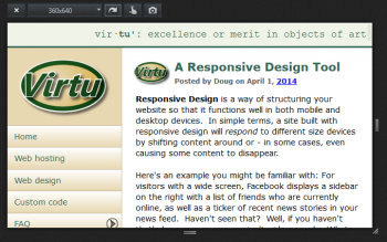
Responsive Design is a way of structuring your website so that it functions well in both mobile and desktop devices. In simple terms, a site built with responsive design will respond to different size devices by shifting content around or - in some cases, even causing some content to disappear.
Here's an example you might be familiar with: For visitors with a wide screen, Facebook displays a sidebar on the right with a list of friends who are currently online, as well as a ticker of recent news stories in your news feed. Haven't seen that? Well, if you haven't that's because your screen isn't wide enough. What does facebook do in that case? They simply hide that sidebar. It just isn't there. That's responsive design.
Do you want to see how your site looks in different size windows? Firefox has a great tool to help you out with that. It's called Responsive Design View. You can access the Responsive Design View in a couple ways:
- From the main menu, slide down to 'Web Developer' and then select 'Responsive Design View'.
- Just press CTRL-SHIFT-M to toggle this view on and off.
When you choose this tool, your browser squeezes your content into a small rectangular block in the upper left corner of the browser window. Notice that above the block there is a dropdown list that shows you the current size. The size listed will be a standard device size.
Also notice that next to the size dropdown, there is a 'rotate' button (it has an arrow icon). This will toggle the dimensions from portrait to landscape, so you can see what your site would look like if someone was holding their device in a different orientation.
Choose different sizes and orientations, and see how your site looks. This is especially a good idea after you've added new content which contains images or other special content; you'll want to make sure these things display properly in all devices!
One of the challenges of building content for a website is deciding how to lay out pages in a way that looks great on a desktop monitor, but also looks great on a mobile device that is as narrow as 640 pixels, or even 320 pixels.

Columns
When you are generating content for your site, you may notice an icon that appears like an arrow curved down and then upward. That icon is your column break icon. Using this will insert a column break marker in your content. But how does the two-column format play out in the world of mobile?
Very simply. Your website will display the content in a two column format in a wide device, but in a narrower device, that second column will shift downward, and will appear below the first column instead of next to it.
For this reason it's important to remember that when writing content, you should not refer to anything in the second column as being "next to" or "to the right," because depending on the device, it may not be next to the first column at all!
Also, remember that if all your images are in the second column, they are "below the fold" (not visible without scrolling) for mobile users. For this reason, if you are using columns, you may wish to include some images in both columns.
Speaking of images...
Images
How should you set the width of an image? When you insert an image, the media dialog will prompt you for an image size. You should always enter a number and a unit. What units can you use? Well, there are a lot of them! px, em, %, pt, and others. The ones that will be most useful to you are px (pixels) and % (percent).
If you set the width to "100px," then the image will appear at the same width regardless of the device in which it displays. For this reason, it's wise to never set the size to more than 300px, since your site may be viewed in a 320 pixel device, and you want to make sure you have at least a little bit of white space around the image.
Another option is to use %. If I set the width to 40%, that means that the width of the image is 40% of the available content width. If you are using columns, that's 40% of the column width. If you're not using columns, that's 40% of the entire content width.
What's the advantage to using percents? Well, suppose you had set an image width to 100px, and the site is viewed in a device that is narrow enough that your column is 120px wide. Then you'll have 20 pixels for content to slide around the edge of the image, and it'll look quite ugly. But if you use a percent, the image will shrink with the column, so you'll never run into that issue.
A good rule of thumb would be: if an image is small - less than 50 (maybe 100) pixels - go ahead and use a fixed size. But if it's going to take up a big chunk of your content width, use percents instead.
Recently I was browsing a business website (it was the site for the third largest shopping mall in our state) and I came across the horrific line of text displayed below. It made me want to cry.
But it also reminded me that grammar, spelling, and punctuation errors are mistakes you do not want on your website! For our clients at Virtu, we have partnered with Portland Proof to provide proofreading services for your content.

How does it work? Simple. Send us a list of links to the pages you want to have proofread. Portland Proof will evaluate the amount and quality of writing, and quote you a price for the work. Once you've paid, proofreading begins. Depending on the size of the project, this can often be completed within 24 hours.
It's not difficult. It's not expensive. And remember: mistakes you make once will be on your site for a lifetime. A one-time payment for proofreading can save you a lot of embarassment.
Welcome to our new blog at Virtu! On these pages we'll keep you informed about:
- New features being added to your hosting service
- New modules that have been (or will be) added to your administrative software
- New features that are being added to existing administrative modules
- Sites and services of interest to webmasters